
Watch someone use a badly built site on their phone. The pinching. The zooming. The careful aim at a link the size of a pinhead, then the wrong one fires anyway.
They last about eight seconds of that before giving up. And they don’t email to complain. They just leave, and quietly decide the business is a bit amateur.
Here’s what makes it sting. Most traffic is on phones now, often well over half. So a site that only truly works on a laptop is failing the majority of the people it reaches, every single day.
Responsive web design is the fix, and it’s less about looking pretty on a phone than about not driving people away. The Tech Designers build sites this way as standard, because the mobile visitor isn’t an afterthought anymore. They’re the main event.
What Responsive Web Design Actually Means
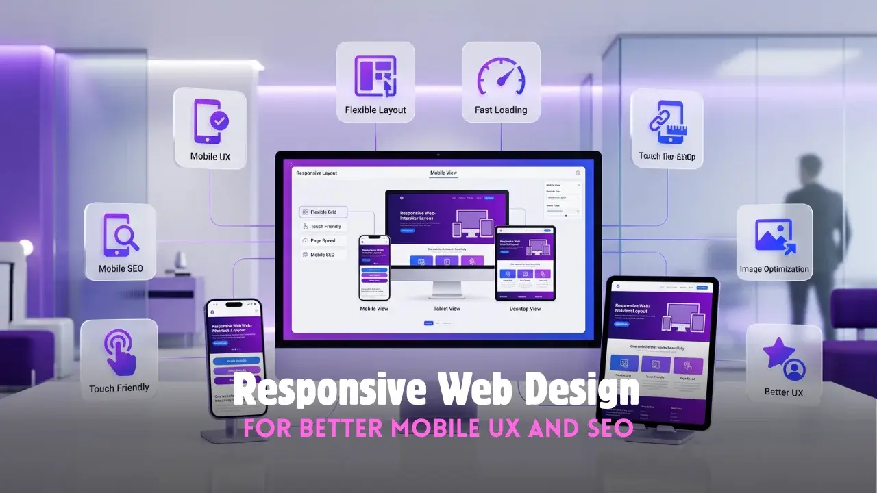
The phrase gets thrown around loosely, so it’s worth pinning down. Responsive web design means one site that reshapes itself to whatever screen it lands on.
Not a stripped-down mobile version parked on a separate address. One site, one set of content, fluidly rearranging so it works on a wide monitor, a tablet, and a phone alike.
The alternative is grim. A fixed-width site on a phone forces the zooming and side-scrolling that sends people running. A proper mobile-responsive website simply fits, whatever the visitor happens to be holding.
Why A Mobile-Responsive Website Changes The SEO Picture
This isn’t only about visitor comfort. Google made mobile the deciding factor years ago, and plenty of businesses still haven’t caught up.
The shift was mobile-first design, and it changed the rules underneath. Google now judges the phone version of a site when it decides where to rank it, so mobile-first design stopped being optional and became the baseline.
That ties two goals into one knot:
- a mobile-responsive website ranks better because Google favors it outright
- it converts better because the majority already arrive on a phone
- it dodges the penalty a desktop-only site quietly absorbs in search
A mobile-responsive website, in other words, feeds SEO and sales from the same effort. Neglect the phone, and both slide together.
The Building Blocks of SEO-Friendly Web Design
Good responsive work rests on a few technical ideas, and none needs a computer science degree to grasp.
Flexible Layouts and Images
The core trick is refusing to hardcode a width. Flexible layouts let the page bend and reflow to the screen instead of snapping at the edges.
Images have to stretch and shrink to fit their space. Text has to reflow so nothing runs off the side. SEO-friendly web design leans on flexible layouts precisely so a phone visitor never meets a horizontal scrollbar.
Speed and Touch
Phones often run on patchy signal, so weight matters more here than anywhere. A heavy page that limps on mobile undercuts the whole point.
- compress images so the page loads fast on a weak connection
- size buttons for a thumb, not a mouse pointer
- keep tap targets far enough apart to miss the wrong one
Get that right and SEO-friendly web design turns into genuine user experience design, a site that feels effortless in the hand rather than a fight.
How Responsive Web Design Services Lift The Whole Experience
Strong user experience design is the quiet thread through all of it. A site that adapts cleanly just feels trustworthy, even when the visitor couldn’t say why.
That feeling is what responsive web design services are really selling. Not decoration, but the sense that a business is competent, because a site that works smoothly on a phone implies the rest of the operation does too.
Good responsive web design services also think past today’s screens. New phone sizes, foldables, tablets nobody’s shipped yet, all handled by a design built to flex rather than one pinned to fixed dimensions. Thoughtful user experience design plans for the device that doesn’t exist yet.
The best responsive web design services treat mobile as the starting point, not a box ticked at the end. The Tech Designers works that way on purpose, since a site designed phone-first tends to feel sharper on the desktop too.
Why Responsive Web Design Keeps Paying Off
The web won’t sit still, and that’s the case for building flexible from the start.
Screens keep multiplying. Watches, foldables, whatever lands next year. A rigid site needs rebuilding for each new shape, while a responsive one mostly takes them in stride.
That’s the long return on responsive web design. A site built to adapt stays usable as devices change, instead of aging into something that only really worked on the screens of the year it launched. The businesses that win the mobile visitor aren’t chasing every new gadget. They just built to bend in the first place.
Frequently Asked Questions
What is responsive web design?
It is designing one site that automatically adjusts to fit any screen, from phones to desktops.
Why is mobile-friendly design important for SEO?
Google ranks sites on their mobile version, so a poor phone experience hurts search visibility.
Is a separate mobile site better than a responsive one?
Usually not, since one responsive site is easier to manage and preferred by search engines.
How do I know if my site is responsive?
Open it on a phone; if you have to zoom or scroll sideways to read, it likely is not.
Does responsive design cost more?
It is standard practice now and typically included, saving the cost of a separate mobile build.